 This is a star plot of multivariate data or a graphical data technique of representing crime rates in the United States. Each shape represents different variable amount but oddly enough they aren't star shaped they are irregular shaped polygons.
Tuesday, December 2, 2008
Star Plots
This is a star plot of multivariate data or a graphical data technique of representing crime rates in the United States. Each shape represents different variable amount but oddly enough they aren't star shaped they are irregular shaped polygons.
Correlation Matrix
 Correlation Matrix uses a series of colors to visualize correlation among a random set of qualitative variables . Unfortunately Methodologist don't see this method as a useful validation technique due to differing degrees of importance.
Similarity Matrix
 Similarity Matrix uses a series of colors to visualize similarities from a set of qualitative variables to create a simple decision tree using algorithms. Unfortunately Methodologist don't see this method as a useful validation technique due to the degree of difficulty in replication.
Stem and leaf plot

This is a stem and leaf plot that quickly summaries graphical displays of quantitative data in intervals. The feature is useful in determining the mode and median as well as comparing data sets.
Box Plot

Box plots are statistical measures of the median, upper and lower quartiles, and the minimum and maximum values which is useful when comparing side by side data sets but detailed information can be lost analyzing exploratory data.
Histograms
 This is a statistical summary representation of approximate frequencies of students (classes) that scored various percentages (frequency) during final exams. This process is useful in determining probability.
Parallel Coordinate Graph
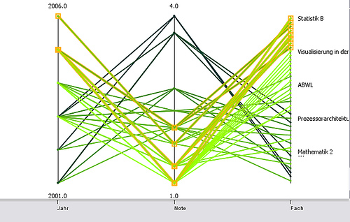 Parallel Coordinate graphs are merely visualized clutters. This graph attempts to plot multivariate analysis on the same graph but this causes confusion and inconsistencies with readings.
Subscribe to:
Posts (Atom)