 This is a star plot of multivariate data or a graphical data technique of representing crime rates in the United States. Each shape represents different variable amount but oddly enough they aren't star shaped they are irregular shaped polygons.
Tuesday, December 2, 2008
Star Plots
This is a star plot of multivariate data or a graphical data technique of representing crime rates in the United States. Each shape represents different variable amount but oddly enough they aren't star shaped they are irregular shaped polygons.
Correlation Matrix
 Correlation Matrix uses a series of colors to visualize correlation among a random set of qualitative variables . Unfortunately Methodologist don't see this method as a useful validation technique due to differing degrees of importance.
Similarity Matrix
 Similarity Matrix uses a series of colors to visualize similarities from a set of qualitative variables to create a simple decision tree using algorithms. Unfortunately Methodologist don't see this method as a useful validation technique due to the degree of difficulty in replication.
Stem and leaf plot

This is a stem and leaf plot that quickly summaries graphical displays of quantitative data in intervals. The feature is useful in determining the mode and median as well as comparing data sets.
Box Plot

Box plots are statistical measures of the median, upper and lower quartiles, and the minimum and maximum values which is useful when comparing side by side data sets but detailed information can be lost analyzing exploratory data.
Histograms
 This is a statistical summary representation of approximate frequencies of students (classes) that scored various percentages (frequency) during final exams. This process is useful in determining probability.
Parallel Coordinate Graph
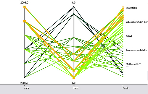 Parallel Coordinate graphs are merely visualized clutters. This graph attempts to plot multivariate analysis on the same graph but this causes confusion and inconsistencies with readings.
Triangular Plot
 This image is redundant, a triangular plot is just that a a three dimensional object hence the triangle with three variable percentages plotted within the triangle. This has been very useful in the real estate market to show profitable interest within certain areas.
Windrose
 This is an graphic instrument that uses a compass point to to determine wind direction and speed by meteorologist to prepare weather updates.
Climograph
This Climograph is a visual representation of two variables , precipitation and temperature over a specific time plotted on a graph . This is useful in determining the average weather for an area during a particular time or season.
Population Profile

This is a population profile of the United Kingdom. It is an analysis of the male and female population in various age ranges. This information would be useful to the Census Bureau when looking at funding for social programs.
Scatterplot

This scatter plot graph is quick and easily designed by plotting multivariate values that share a common association or correlation on a graph free handed. As seen in this scatter plot the years of experience a person has will ultimately affect their income.
Index Value Plot
 The index value plot graphs condition of sites being monitored from 1988 until 1993 for changes in vegetation area in sampled woodland sites. Index value plots are useful when showing change over time.
Accumulative Line Graph
 This is an example of the Lorenz curve or an Accumulative line graph meaning the overall probability of two scenarios distributed on a graph. These distributions can be infinite but will always start at 0 but are invariant .
Bilateral Graph
 This particular bilateral graph shows positive and negative values for two variables global corporate governance versus the nations wealth in 3rd world countries in 2002. The strong the corporate governance the stronger the nations wealth.
Monday, December 1, 2008
Nominal Area Choropleth Map

Also known as a descriptive map this nominal area choropleth map provides geographical information about Canada's vegetation. The variation in color is associated with qualitative differences.
Standardized Choropleth Map
 Even though the legend is unclear this is a standardized choropleth map by normalizing raw data in other terms, providing percentage information of the total population of Canada residents that are 14 years old and under during the 2006 census.
Bivariate Choropleth Map

The side by side compasion map represent two sets of spatial data, the correlation between land use and life expentancy in Africa, on one map with nominal data and an interactive use of color.
Classed Choropleth Maps

As with most classes choropleth maps it is easy to interpret this map, with very few colors being used it is less confusing to distinguish between the different data attribution classifications being displayed.
Continously Variable Proportional Circle Map
 In a continously variable proportional circle map the size of the symbols will vary due to the direct value of the data it represents. The bigger the circle the more value it holds.
DOQQ

DOQQ also known as Diqital Orthophoto Quarter Quandrangles is one quarter of a digital angle that is displaced by the camera angle in which the terrain has been removed at a scale of 1:12,000.
DEM
 Also known as Digital Elevation Model, DEM's are simple regularly spaced elevations of various ground positions. The normal scale is 1:250,000 and is based on latitude and longitude locations.
DLG
 Also known as Digital Line Graph, DLG's are digital representations of cartographic information in large, medium, or small scales derived from ditigal vectors of other maps.
Sunday, November 30, 2008


Saturday, November 29, 2008
Isohyets

The colorful contour lines are used to determine the various amounts of percipitation in an area. This is useful when prepare annual rainfall reports.
Wednesday, November 26, 2008
Isotachs
 The wavy lines on this map is known as isotachs, these are needed to determine wind speeds along with isobars which are recorded in kilometers per hour.
Isobars
 The curvy lines in this image are known as Isobars, which depict pressure gradients of an area. The isobars in this photo are fair close which indicates a steep pressure system moving through.
LIDAR
 This process is known as LIDAR, in simple terms an elevation map. The information obtained using the LIDAR technique is merely reflection data using a laser beam to obtain elevation differences, which is useful in determining topographic changes.
Doppler Radar

This is an image enhanced radar derived data product obtained over a period of time using the doppler effect to diagnose the weather of a given area.
Black and White Aerial photo
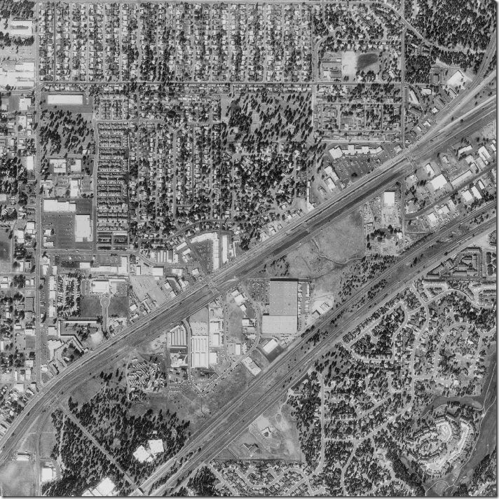 Also known as orthophoto, this black and white aerial high altitude images provide great detail of the area. From this high view once can see the differences in terrain relief which can be very useful when it comes to updating surface features on maps.
Infrared Aerial Map
 This photo is a "sky" view using infrared aerial mapping, which is most useful for planning Agriculture. Different color tones have different meanings for instance, this shot contains mostly live vegetation which is denoted in red. The green coloring denotes dead vegetation, whereas the blue represents ground and can vary in color depending on the moisture content it holds.
Cartographic Animation

This is an example of cartographic animation it is real time animation that changes as the event changes. These maps are user defined and the information generated is a result of what is questioned, in the case it is cancer deaths in Nebraska County.
Statistical Map

"Statistical map of Napoleon’s Russian campaign of 1812 ", the map provides the temperature pattern experienced during August - October. As well as a statistic count of soldiers and their advancement or retreat.
Cartograms
 I would love to tell you what this cartograms represents but I can't because it is in Spanish. What I can tell you is that is picture represent the same statistical data but at different valuations, hence the enlarged shapes. Cartograms are based upon size depictions but the positioning and approximately scales are as close as possible to the original.
Thursday, November 20, 2008

Sunday, November 9, 2008
Isoline Map
 This is an Isoline map used to display the weather within the United States that will be experiencing a cold front on this particular day. This particular map is called an Isotherm because it is pertaining to temperatures.
Wednesday, November 5, 2008
Proportional Circle Map
This is a proportional map which shows the composition of the surround bodies of water. Each circle is sized and colored according to the color of the body of water it represents and the size of gravel and the rocks within that body of water. 
Saturday, November 1, 2008
Choropleth Map
 This is a chloropleth map of water usage per State for the continuos United States. The designer of this map has chosen to various forms of blue to represent consumption usage.
Friday, October 31, 2008
Dot Distribution map

This is a dot distribution map reporting the number of AIDS cases reported within various region within the population for the United States. When viewing this map type it can be misleading because the dots randomly plotted unless a vector imagehas been utilized, which most designers don not as it is more tedious to construct.
Thursday, October 30, 2008
Propoganda Map

This is a propogranda map created by the Nazi which has a political content and is expected to get intentional emotion out of it's viewers, by providing a biased view of what the designer thinks the citizen of Germany should know about it's inhibitants.
Wednesday, October 29, 2008
Hypsometric Map

Monday, October 27, 2008

Sunday, October 26, 2008
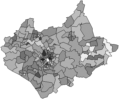
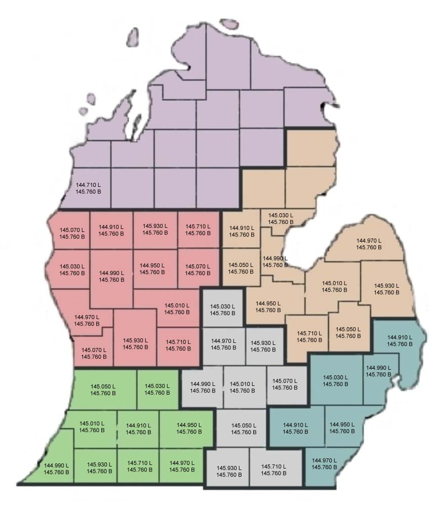
Cadastral Map
 This is a cadastral maps, it shows color coded boundaries for each district on the map. This type of map is used mostly to determine land or parcel ownership but in this particular instance it is being used for boundaries.
Friday, October 24, 2008
Thematic Map
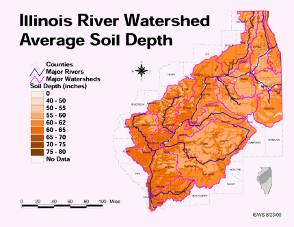 This is a thematic map which is displaying bivariated information such as the average soil depth in Illinois and water sources running through the area, whether its is a major river or a watershed.
Tuesday, October 21, 2008
Topographic Map

This is a topographic map that shows quantative landscaping information through the use of contour lines. This map is useful because it also shows natural and man made resources such as bodies of water in the surrounding areas or mineral deposits, which is useful for strategical or landscape planning.
Monday, October 20, 2008

Thursday, October 16, 2008
Mental Maps
 This is a picture of a mental map, in other word the way our mind interprets our understanding of something, whether it is a step by step process or a route to a geographical location.
Subscribe to:
Posts (Atom)